A friend recently sent me a link to an article about the precarity of the US Social Security system. The headlines read: Social Security’s Finances Erode Further, Risking Benefit Cuts
The nation’s key program for retiree benefits continues to see financing shortfalls. Unless Congress acts, those drops could lead to payment cuts in eight years. [NYT 6/18/25]
 | | Photo courtesy Pixabay |
Of course it scared her. She noted: “Not good news for us old folks.” I had to respond: The solution is either to find remedies or go broke. I am not as worried as my friend. I don’t think any politician will be willing to reduce payments to current seniors receiving benefits or to those soon to receive benefits. That would be suicide. (Voter participation by age; Voters by age group Table 1) On the other hand, I do hope that eventually (actually sooner rather than later) our legislators will have enough sense to do one or more of the following (and it will need more than one):
- Raise the retirement age for most categories of older workers except a few that work in jobs that are physically demanding; and do it for generations down the line, not the ones coming up to retirement age in five years. This is in order not to penalize those who are counting on benefits soon, and to insure that the younger ones will have time to prepare themselves or find a source of help.
- Reduce the payments for more wealthy seniors.
- Increase the threshold for taxation of higher salaries.
- Find ways to get people to put more in their 401(k)s.
- Enlarge the 401(k) and other retirement programs, or create new types of portable or individual retirement savings accounts for people who don’t have them through their employer.
- Teach people at a young age to save more money instead of spending everything they earn. They should be able and encouraged to establish an independent retirement fund for themselves. Most people, especially those who are on the lower salary levels (i.e. those who need it most), believe they are going to be covered by Social Security in their later years and just don’t know how (or want) to save money. And yet it is possible even on a tight budget. Small regular savings-accounts contributions will increase in value dramatically over time with compounded interest. And for those who truly can’t seem to save a penny because of family obligations or other difficulties, the focus should be on improving professional skills and hence one's financial situation (fun and yet still very instructive videos about budgeting and getting oneself out of debt and into financial security).
- For the truly indigent and needy individuals, pass legislation encouraging local nonprofits to expand their aid programs and to function in a more targeted and community-oriented way.
- Educate youngsters – and adults – about the dangers of the overuse or abuse of credit, and about the terrible losses that can occur due to the punitive (and rightly so) expense of not paying revolving credit accounts within the first month or so. (This is compound interest in reverse times ten.)
- Other options that do not involve increasing government intrusion into the marketplace or inventing unconstitutional legislation, but that would cure some injustices in the status quo. (More on those another day.)
That may sound hard and/or unrealistic, but that’s what I believe must be done. Do I think it will be done? I’m not betting on it.
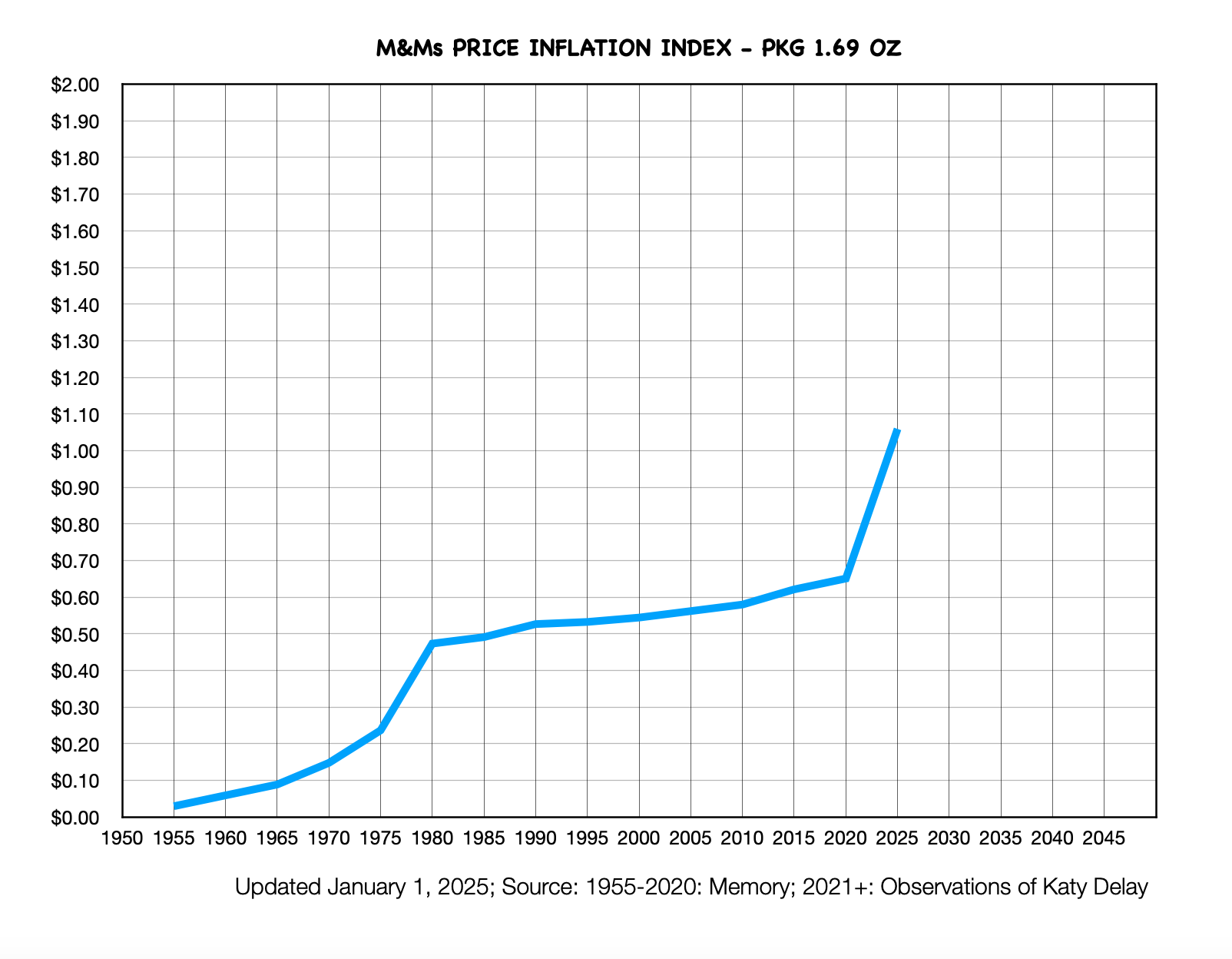
2025 is already upon us, and it’s time to update the M&Ms Inflation Index. Like some of you, I remember when a 1.69 oz packet of M&Ms was 5 cents. Yes, that’s back in the 1950s. Today, the price of that same packet has gone up to $1.79. For you mathematicians, that’s a whopping 3,480%! And that means the dollar’s purchasing power has gone down in the opposite direction, maybe something approaching the same amount only in reverse. M&Ms are made by the Mars Company. (By the way, the Mars family has quite an interesting history.) They have made it a point to offer the 1.69 oz packet since the company began to make them, come hell, high water, or monetary inflation. Of course they also understood that a variety of sizes and prices can please the public, so you find their products in a plethora of different packaging. So for the economists among you, here below I have updated the chart for the 1.69 ounce pack: A professional economist friend of mine, Peter Earle at AIER, explained that price inflation has certainly contributed to the uptick in our favorite snack. In this particular case, however, there is another factor: cocoa bean farmers are having terrible problems with their crops, especially in Africa where most of them are produced. Here’s a chart giving the price of cocoa for the last five years, from TradingEconomics.com:
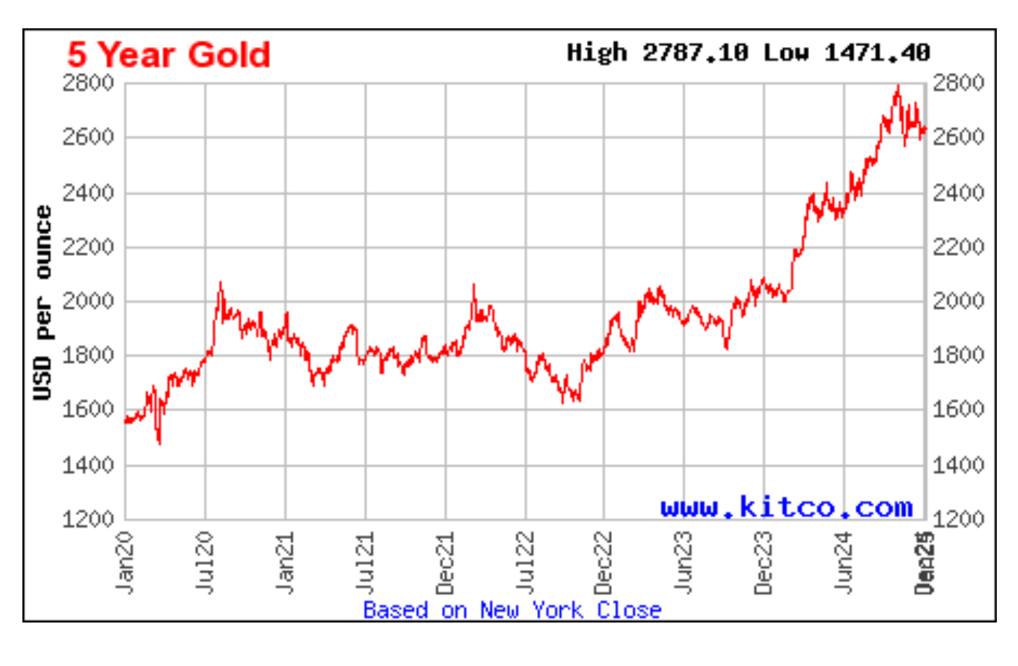
The price has risen about 340%in the past year and a half – quite extraordinary, and most probably not just due to monetary inflating of the money supply. J.P. Morgan has what I judge to be a reasonable explanation of the cocoa phenomenon. They describe the causes of the increase in the price to be mostly due to local economic, political, social, and market pressures, not linked directly to monetary inflating, other than on the retail downstream product level. One supposes that the local and international devaluation of money through monetary inflating could indeed bear some responsibility, but it's difficult to determine how much. We’ll just have to see, if and when the farming problems are solved, whether the price goes down. Cocoa prices have indeed subsided a bit, but on the retail M&M level will the reduction be reflected in your M&Ms? What’s your bet? Given the market factors in the price of chocolate, our M&M Standard is perhaps imperfect. Dare I end this by stating that one of the best barometers to use in determining the loss of value of a currency is gold? Here is Kitco's gold chart showing how many dollars you get per ounce:
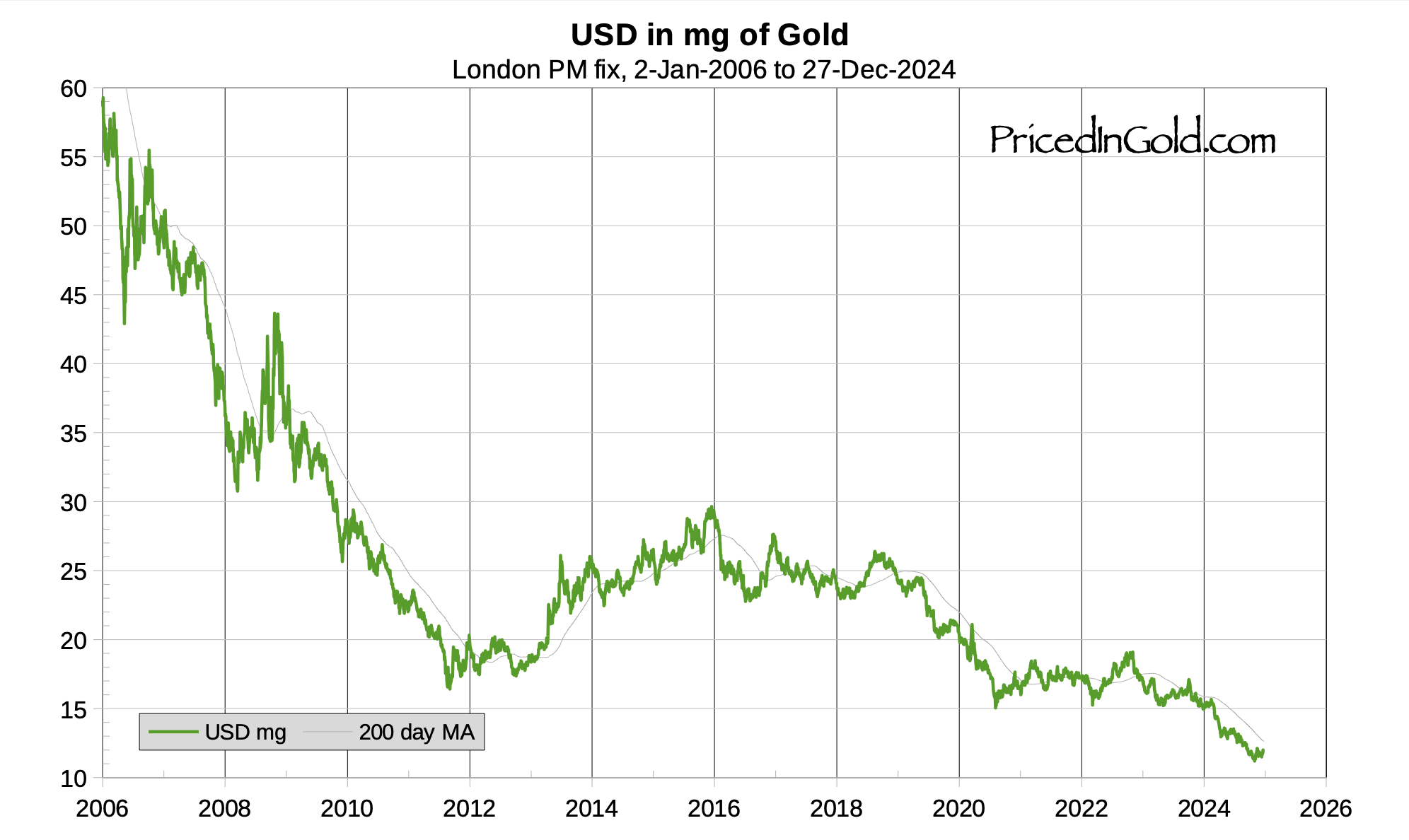
I also like this one from PricedinGold.com, showing how many milligrams of gold you can buy for a dollar. It really hits where it hurts. And for this you can blame the indebted-dollar farmers at the Fed and the distributors of these inflated and borrowed dollars: Congress.
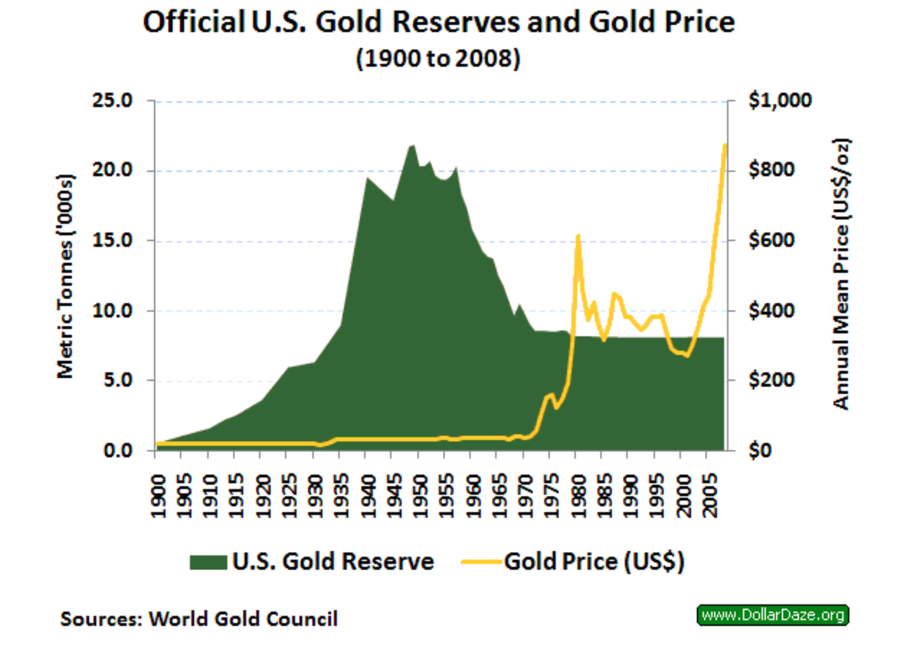
What trajectory did the US gold reserves follow in the last century? Below is a World Gold Council chart that might be accurate, although there is some debate today about exactly how much of the US gold reserves are accurately accounted for. Some say a portion of it is no longer there, some say that a percentage has been used in financial transactions that would involve claims to some of it. But the chart is probably not far off. You can see that gold began leaving the country starting in the mid-1950s. By the end of that decade a few wise financial advisors were recommending investing extra savings – i.e. savings one could afford to risk – in numismatic gold and gold stocks. (It was illegal to hold gold outright.) The reason was that the gold standard kept the official dollar price at $35, but there was so much dollar inflating going on that foreign countries were smart enough to get gold instead of holding onto dollars (which dollars had been received in payment for imports), and this was causing the unofficial market gold price in dollars to rise. That’s why in 1971 Nixon probably looked at a similar chart and finally said stop, no more, we’re “closing the gold window.” And that’s when the dollar price took off, as wise advisors had predicted it would. More accurately, that’s when the exchange rate for dollars plummeted and price inflation in the US began to explode. (Yes, price inflation can be late to the party, but it always follows a period of monetary inflating.) (The yellow line represents the dollar price of gold.)
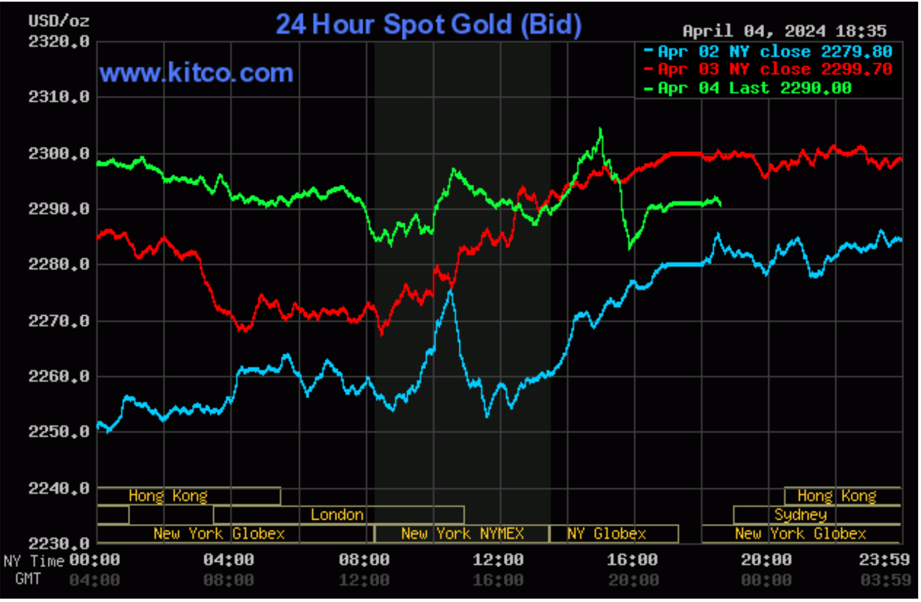
Note that this chart stops in 2005. Here below is the chart from Kitco for the last three days. The dollar price is up to $2,290 as of this writing, even touching $2,304 for the first time in history. Not a bad investment, right? (But I’m not an investment advisor.)
Gold always seems to reflect the reality of the value of money, even if it no longer is officially an element of any country’s monetary standard. Who said the gold standard is dead?
Someone recently asked me to explain the term “Stagflation." Some of you probably remember the Nixon years, the early 1970s. This is the period when Stagflation was flagrant. It’s simply the combination of two words, stagnation and inflation. Everyone seemed shocked that both could occur at the same time. This is because back then (and still in the minds of a few today), a Keynesian theory called the Phillips Curve was in vogue. It said that “inflation and unemployment have a stable and inverse relationship.” But in fact this turned out not to be true, since in the early 1970s we had high price inflation and high unemployment combined with low GDP, which by itself is often described as stagnation. The term “stagflation” was first used by an Englishman, according to this website. The article gives such a good description of the issues involved that I really think you would find it interesting.
My electric bills have been going up for the past few years, so I decided to analyze the data to figure out what was changing. Was it the consumption? Was it the per kWh charge? Was it the taxes? Maybe the service charge(s)? Or something else? The consumption was pretty predictable and regular. Interestingly enough during these inflationary times, the per kWh charge was exactly the same over an eight year period. Taxes and other state charges didn’t seem to be modified very much, and the monthly service charge was also unchanged. So where is the culprit? In California, they have come up with what was supposed to be a credit to our account due to the use of renewable energy. They must have thought that renewable energy sources would provide less expensive electricity. Starting in 2016 in our case, this line on the bill was a very tiny credit. But as time has gone by, that column has morphed into a charge climbing steeply. See the result on my chart below. This supplemental charge is calculated as a percentage of total consumption multiplied by the kWh price, so it moves up and down with changes in consumption. But you can still see the trend. Where it used to be a negative number, it has now reached a level of about 30% of the kWh rate, and hence of the whole bill.
This “Energy Cost Adjustment” has become a way for the company to increase our price while maintaining the per kWh rate. Perhaps they’re just trying to deal with California’s crazy laws, but it’s still VERY SNEAKY, don’t you think?
So is it just an underhanded way of increasing the price? Or did everyone simply misjudge the cost of renewable energy?
More Recent Articles
|