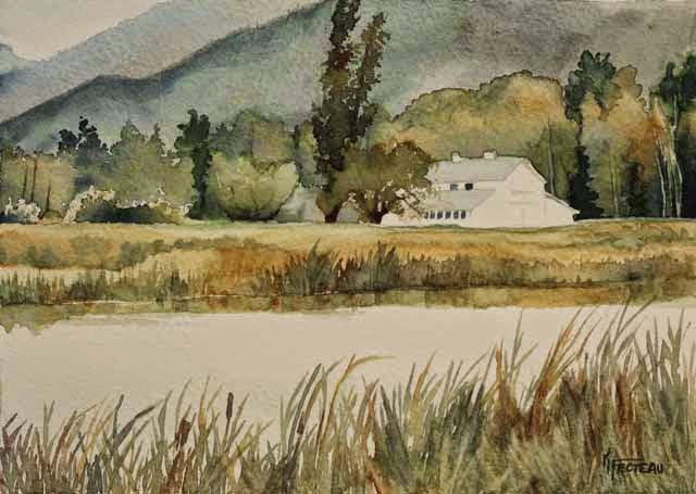
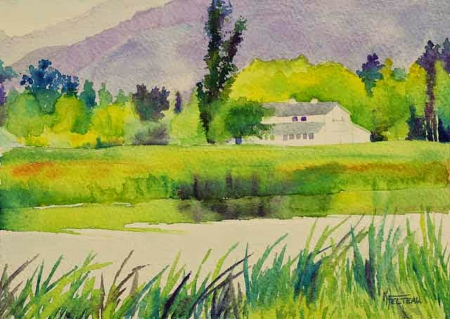
"Refuge Barn I" and "Refuge Barn II" are both 5"x7" watercolor on 140 lb. watercolor paper. These painting were a demonstration for both the Beginning and Intermediate Watercolor Adult Education classes. These demonstrate how different palettes of color can create different moods.
"Refuge Barn I" was painted using more muted tones: quinacridone gold, payne's gray and a touch of burnt sienna.
"Refuge Barn II" was painted with brighter tones: hansa yellow, phthalo blue and quinacridone magenta.
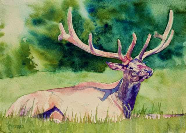
"Elk" is a 5"x7" watercolor painting on 140 lb. watercolor paper. It was a demonstration for my Adult Education Intermediate Watercolor class which I teach each winter at Stevensville High School in Stevensville, MT.
As a challenge, I wanted to use random colors to paint the elk instead of using the true colors from the reference. I asked each student as they came in to class what their favorite color was. A couple said green and one said blue-green. Well, that wasn't going to be much of a challenge as I can apply those colors to the foliage.
Finally, the last student came in and said that her favorite color was pink. At last, how about a pink elk? So the colors used in this painting are opera (a bright vivid pink), phthalo blue and hansa yellow. The elk has opera, with blue mixed for shadows, and with yellow mixed for the sunny warm areas. The grass and trees are mixtures of the blue and yellow.
The original reference photo was contributed by an artist for the reference library at
www.WetCanvas.com.